Minimalist Logo Generator
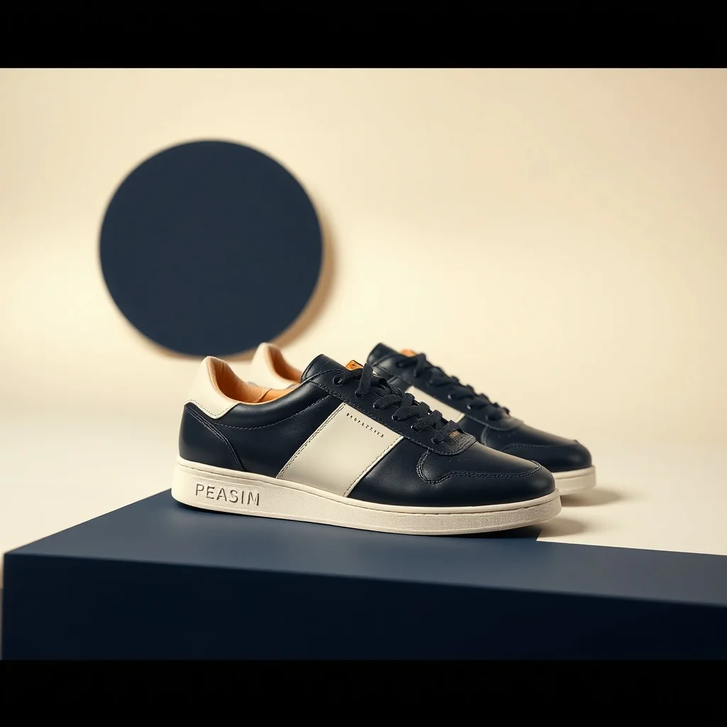
Want a logo that genuinely reads as minimalist? Minimalism strips a design down to the one thing that matters: a single bold shape, a lot of empty space, and nothing competing for attention. renza applies that look from the first pixel, so you get generous negative space and one clear focal element, not a plain logo with a filter dropped on top.
A logo has to read instantly and stay recognizable when it is shrunk to a favicon or printed in a single color. Deep navy paired with warm off-white, occasionally a single accent color. The look traces back to the Swiss design movement of the 1950s, updated for screens, and renza bakes it into a prompt tuned for minimalist logos before sending it to a high-fidelity image model. You get a result in a few seconds that you can refine or download, and every image is yours to keep. Before you commit, shrink the result down to 32 pixels to check it still reads, and test it on both light and dark backgrounds.
- 3 free credits to start
- No credit card
- Commercial use, you own it
- No watermark
- Results in seconds
What defines the minimalist style
Minimalism strips a design down to the one thing that matters: a single bold shape, a lot of empty space, and nothing competing for attention.
Deep navy paired with warm off-white, occasionally a single accent color. The look traces back to the Swiss design movement of the 1950s, updated for screens, and on a logo it gives you a result that feels deliberate rather than generic.
Pro tip · Resist adding detail. If you are tempted to describe a second element, cut it instead, because minimalism is about what you leave out.
- Generous negative space
- One clear focal element
- Restrained two-tone palette
- Clean editorial geometry
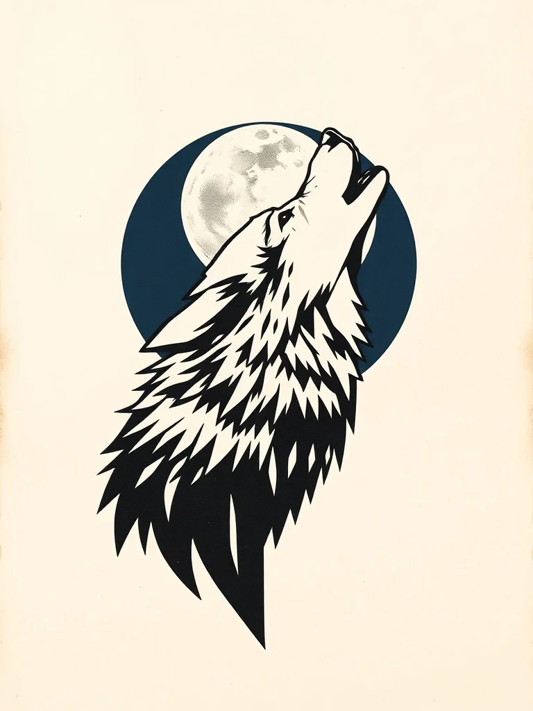
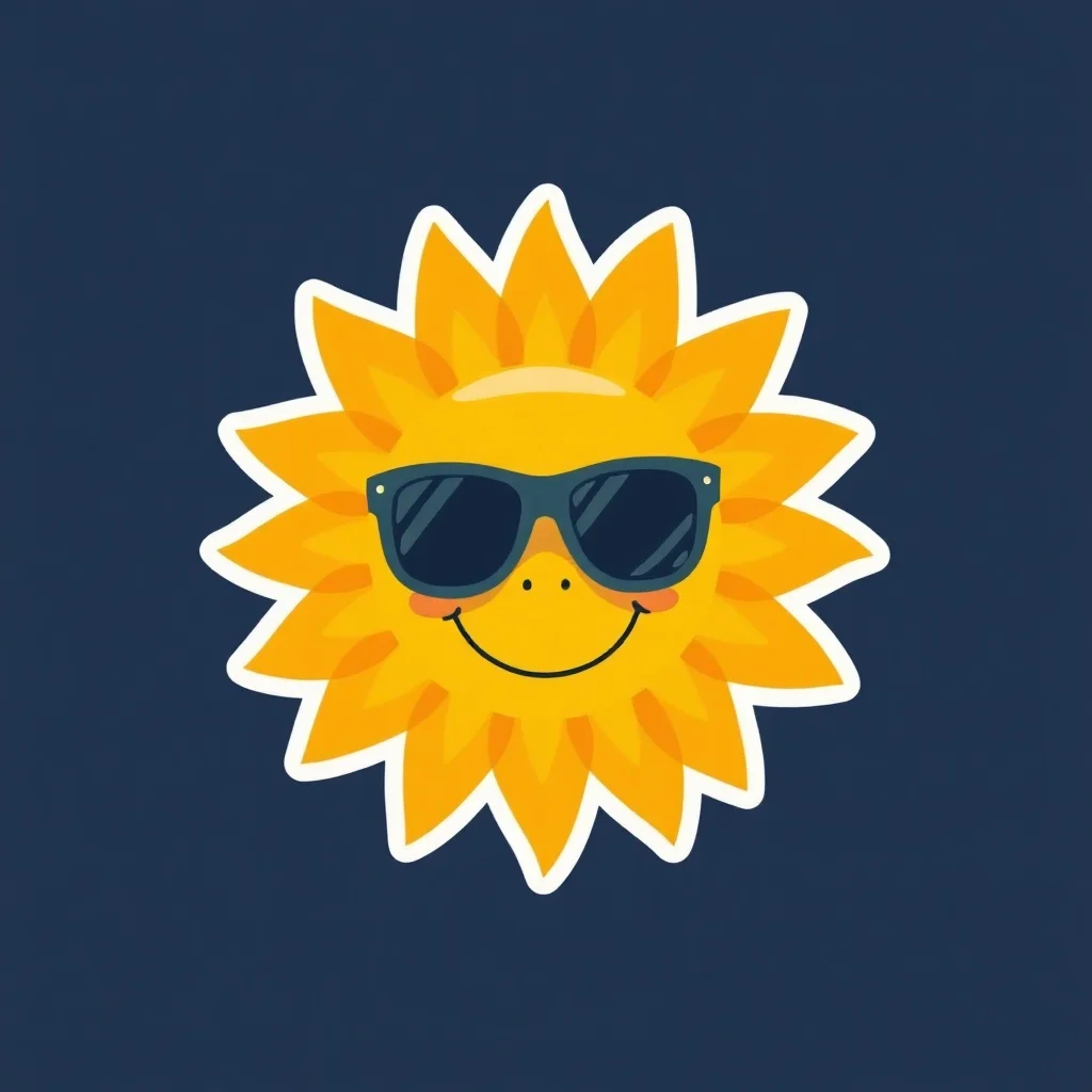
Minimalist logo examples
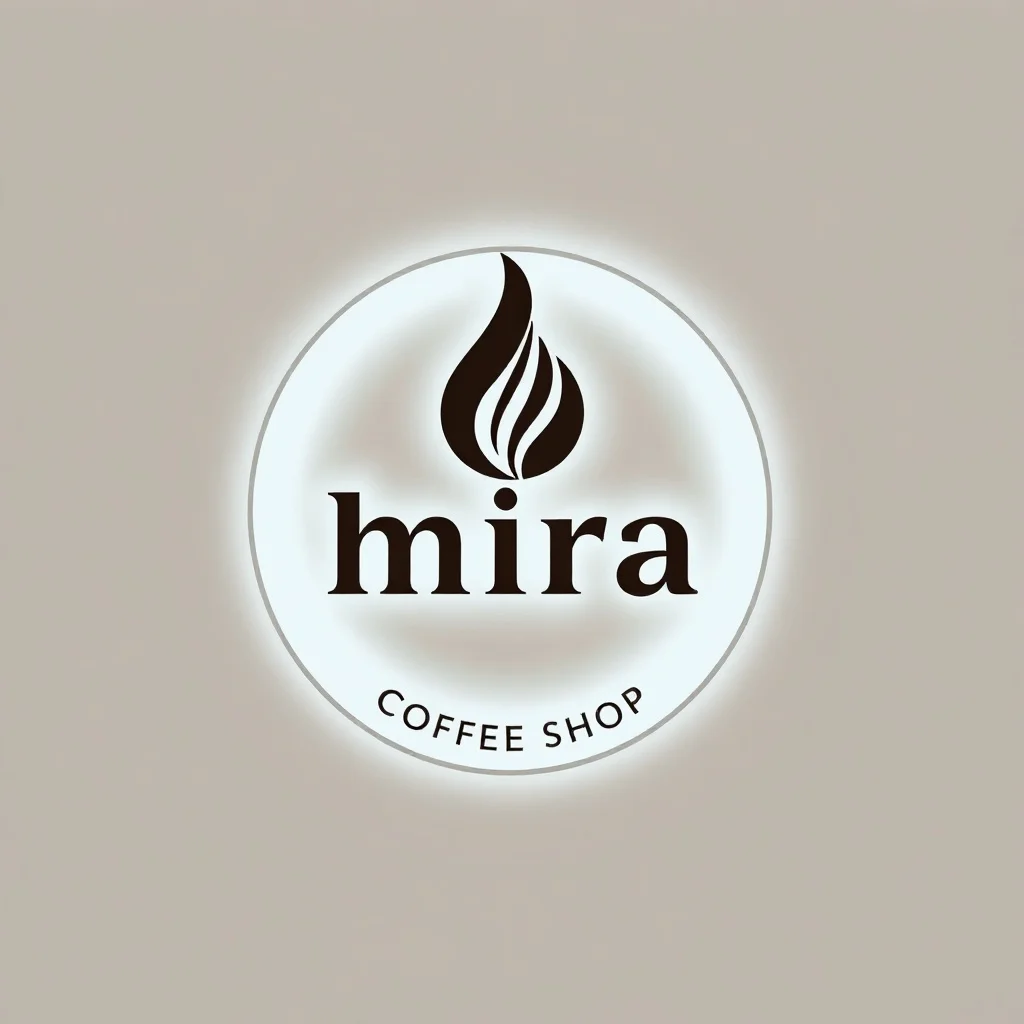
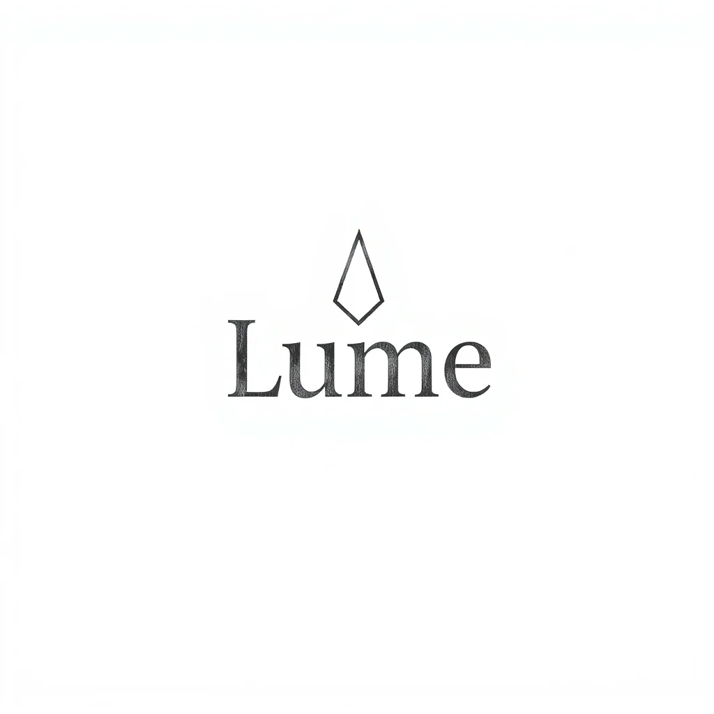
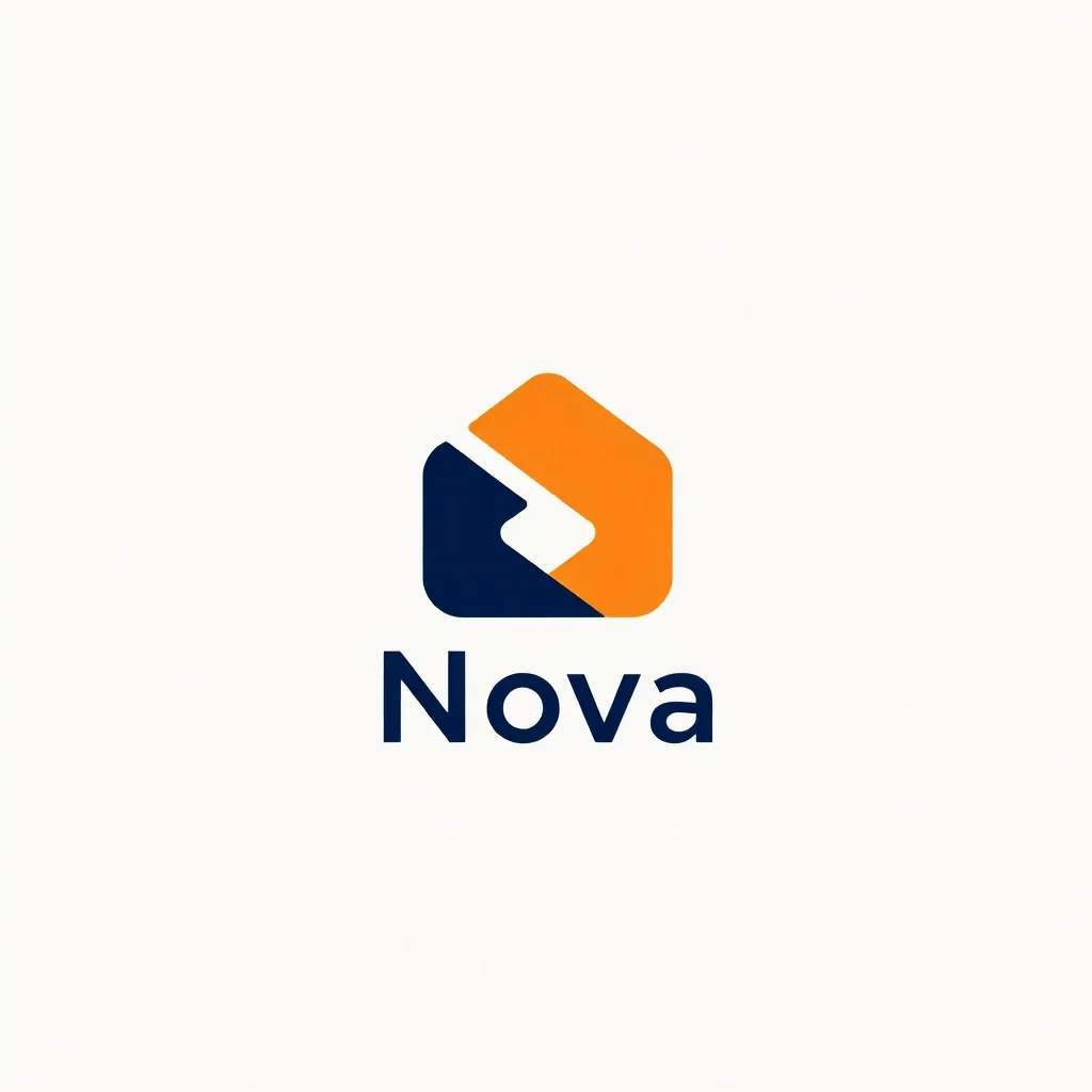
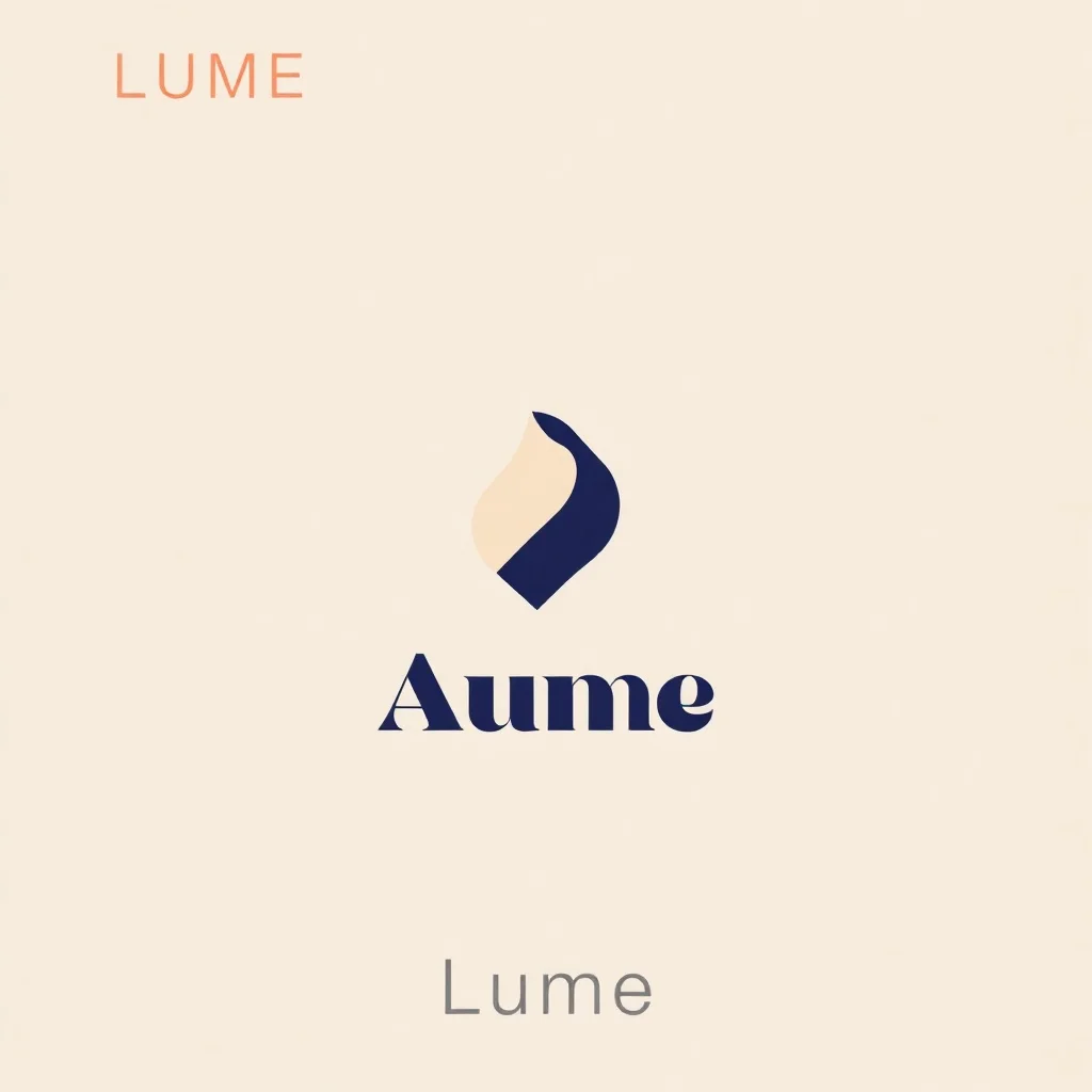
Generated with the same model and style. Click any to open the generator with that prompt loaded.
How to generate a minimalist logo
- 1 Write your prompt
Describe what you want. Be specific. Example: "a coffee shop named Mira". The more concrete the description, the better the result.
- 2 Confirm the minimalist style
The style is already applied. You don't need to mention "minimalist" in your prompt unless you want to emphasize a specific aspect of it.
- 3 Generate
Click Generate. You'll get a logo back in a few seconds. Each click costs 1 credit on the default model.
- 4 Iterate
Not quite right? Tweak the prompt and run it again. Even small changes (one new adjective, one different noun) can shift the output significantly.
Tips for better prompts
- · Describe the subject first, then the context. "A blue mug on oak wood" works better than "blue mug".
- · Resist adding detail. If you are tempted to describe a second element, cut it instead, because minimalism is about what you leave out.
- · The minimalist style is already mixed into your prompt. You don't need to repeat "minimalist" in your text.
- · Think in nouns. For logo, naming a specific material, mood, or setting moves the result more than piling on adjectives.
- · Stuck? Open one of the example prompts from the gallery and tweak a single detail.
Frequently asked questions
What makes a good Minimalist logo?
A logo has to read instantly and stay recognizable when it is shrunk to a favicon or printed in a single color. In the minimalist style specifically, that means leaning into generous negative space, one clear focal element, and restrained two-tone palette rather than fighting them. renza already tunes the prompt in that direction, so your job is mostly to describe a strong subject and let the style do the rest.
Which model works best for a minimalist logo?
For minimalist work, Flux Dev reliably holds clean geometry and even negative space without sneaking in clutter. You can switch models from the dropdown before you generate: Flux Dev is the fast all-rounder, Hyper Realistic is built for photoreal detail, Ideogram handles text inside the image, and Nano Banana 2 is the premium pick for the most demanding results. If you are just exploring, start on Flux Dev and only switch up if the minimalist look needs it.
Can I use my minimalist logo commercially?
Yes. Every image you generate on renza is yours, including for commercial use such as client work, merchandise, print-on-demand, and resale. We don't watermark or claim ownership. The only limits: don't generate real, identifiable people without permission, and respect trademarks. Beyond that, the logo is yours.
How long does each logo take to generate?
Around 6 to 12 seconds on the default model (Flux Dev). Heavier models like Nano Banana 2 take 10 to 25 seconds. There's no queue, so you see the image as soon as it's rendered and can iterate quickly, which matters because most logos land after a few tries rather than the first one.
What if minimalist isn't the right style for my logo?
You have 23 other styles to try, each tuned for a different look. Jump to the Logo generator hub to browse them all, or check the "More generators in Minimalist style" section below if you like minimalist but want a different category. You can also nudge the result with your own modifiers, like "minimalist but warmer" or "minimalist with more contrast".
Any tips before I generate my logo?
Before you commit, shrink the result down to 32 pixels to check it still reads, and test it on both light and dark backgrounds. And one minimalist-specific note: resist adding detail. If you are tempted to describe a second element, cut it instead, because minimalism is about what you leave out.